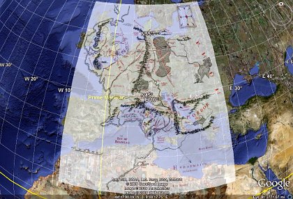
Importing a normal, rectangular map of Middle-earth as a Google Earth overlay is too narrow toward the north.
| Date: | 30 September 2009 |
|---|---|
| Tags: | computing, python |
Update: I have written a script that completely automates the process of building and positioning the Middle-earth overlay described in this old blog post! Simply download the Python script inside this gist, run it, and open the resulting middle-earth-overlay.kmz in Google Earth. The overlay’s position should be far more exact now that the longitude and latitude of the corners are being computed exactly.
Importing a normal, rectangular map of Middle-earth as a Google Earth overlay is too narrow toward the north.
I wanted to measure distances in Tolkien's Middle-earth. While a flat map distorts such measurements, it occured to me that Google Earth can correctly measure both lines and paths across the curved surface of the globe. I soon found excellent documentation for using image overlays with Google Earth, so I downloaded a map of Middle-earth and tried placing it on the globe.
Imagine my disappointment when I saw the result shown in the above image! At first I made the mistake of not holding down the Shift key when resizing the image in Google Earth; the Shift key is absolutely critical for the image to maintain its aspect ratio as you stretch it to the right dimensions. But even after learning this habit, it was painfully clear that the Middle-earth map's projection was different from that expected by Google Earth: the map is far too narrow at the top.
Obviously, it was time to pull out Python, my favorite programming language, and see whether the Python Imaging Library could help me make short work of converting a map from one projection to another.
The script that I created can be downloaded from the following link, and you might want to read through it before reading further:
http://rhodesmill.org/brandon/static/2009/projection.py
It is not my intention in this post to quote the entire script — its comments are ample enough, I hope, to serve as a guide. Here I will just comment on the three most important considerations that writing the script entailed, accompanied by brief excerpts.
One quick hint before we begin: whenever you restart Google Earth, it re-imports your images, but remembers exactly where you placed them last on the Earth's surface. While experimenting with overlays generated by a program, therefore, you can rebuild the image, save it to the same filename, and simply re-start Google Earth to see the result. Another hint: by right-clicking on the name of an overlay in the Google Earth “Places” tab in the sidebar, you can always make further adjustments to where you have chosen to place it on the globe.
Anyway, my first step was determining how the original, rectangular image had to be adjusted to appear correctly in Google Earth. I re-read the venerable essay A Meridional Grid on the Middle-Earth Map, and was disappointed to find that his map of longitude and latitude, upon close inspection, is actually quite sloppy; the supposed lines of latitude are at different distances from each other! But his suggestion seemed sound that, in the original map, lines of latitude probably marched straight up the page, with movement left and right along each line of latitude corresponding to equal distance rather than equal longitudinal angle.
This explained perfectly why the Middle-earth map, when inserted into Google Earth, looked so narrow at the top. As explained in its documentation, a Google Earth overlay image must use the Plate Carrée projection: each row of pixels must span the same longitude as every other row. But the Middle-earth map holds horizontal distance constant, not angle. And as you climb the circles of latitude toward the Pole, a given distance will span a larger and larger fraction of the globe's girth. Therefore, the Middle-earth map needs successively higher rows of pixels to be stretched farther and farther horizontally, to make clear to Google Earth that they are spanning ever wider longitudes with their equal numbers of miles.
The core of my script, then, is the simple function that determines the stretch required of each row of the image, given its y-coordinate:
def mag(y):
    return 1. / cos(latitude(y))
That's it! Having done some spherical trigonometry before, for the rising and setting routines in PyEphem, I had thought that this equation would be much more complicated. But it's not: if you will sketch some circles of longitude, you will find that their radii — and, thus, their circumferences — vary linearly with the cosine of the latitude itself.
The script, as you can verify, does a bit of math to figure out the latitude of each row of pixels, given the latitude of the Shire (which, we know from Tolkien's letters, was roughly the latitude of Oxford) and an estimate of how many miles is represented by each pixel (based on the map's scale, measured with a ruler using the map in my copy of Unfinished Tales). Applying the appropriate stretch to each row of pixels yields an image like this:
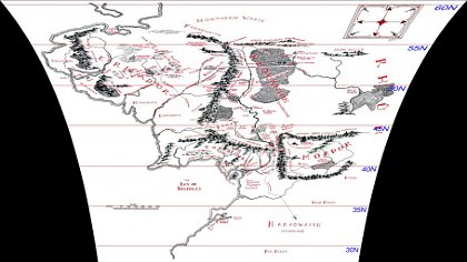
A correct projection of the original rectangular map looks very distorted if viewed as a flat image.
How does the Python Imaging Library help us go from the original image to this?
That is the second discovery I made: a general routine that the PIL calls Image.transform(). The PIL documentation was not very helpful in helping me understand how to call it, so I found some examples on the web. The trick is to provide it a long list of quadrilaterals in the original image that you want copied into rectangles in the new image. Though I could have had it copy boxes that were several pixels high without overly distorting the resulting map, I decided to have it transform each row of pixels separately using exactly the magnification appropriate for that row. Sure, that's several hundred transforms; but what else is the 2.0GHz processor in my laptop for?
Since it is likely that the vertical line running through Rivendell is the “meridian” — the one true north-south line — on the map, I decided to make that x-coordinate the center from which all of the other pixels would be expanded outwards. After giving the name xoffset to the new x-coordinate where that meridian would land in the new, expanded image, I could compute the rectangle into which each old line of pixels should be mapped by “growing” the line outward in both directions from there, as you can see in the core of my script's loop:
for y in range(0, ysize):
    m = mag(y)
    source_quad = (0, y-0.5, 0, y+0.5,
                   xsize, y+0.5, xsize, y-0.5)
    dest_bbox = (int(xoffset - m * xleft), y,
                 int(xoffset + m * xright), y + 1)
    data.append((dest_bbox, source_quad))
The source_quad is simply each whole row of pixels in the source image. It is the dest_bbox that changes in size, expanding outward with the magnification m for each row of latitude.
The third and final lesson I learned is also displayed in the above loop: I am using those odd offsets of 0.5 when specifying the source rows in the original image. Why? Because when I bounded each source line of pixels by the more obvious edges y and y+1, the resulting image was fuzzy. The red lines of latitude that I add to the image, for example (and which are, of course, crucial for positioning it correctly in Google Earth), were all rendered as washed-out two-pixel-high lines instead. It seems that, when naming source areas of an image, the PIL thinks of a y-coordinate as naming the middle of a line of pixels, so that the area from y to y+1 goes from the middle of one row of pixels to the middle of the next row. This, obviously, blurs each pair of adjacent rows together when rendering the output. By using those 0.5 offsets instead, I seem to be asking for exactly one row of pixels, from the top of each pixel to its bottom, and the result is perfectly sharp.
Again, consult the program listing for all of the details. I hope that this brief exposition has introduced you to the PIL, helped you understand one of its more complex but very useful features, or maybe even led you to grasp some of the basic issues involved in map projections and preparing maps specifically for Google Earth. The result, as you can see below, is a map correctly projected against the curve of the globe. Time for me to go start measuring those distances!
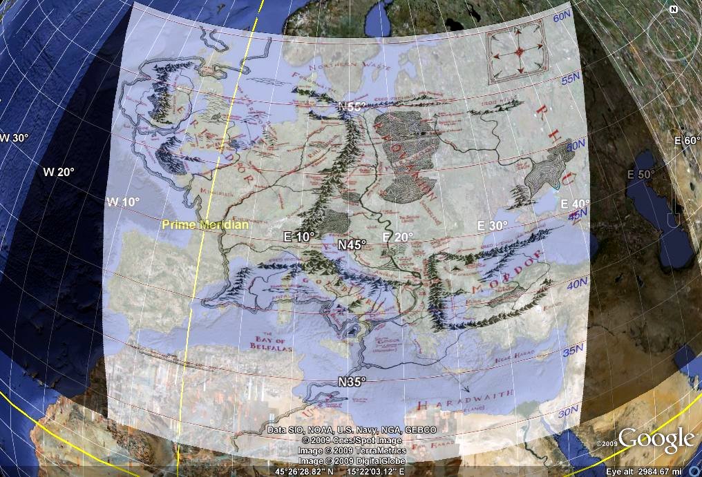
When the re-projected map is imported as an overlay into Google Earth, the result is an attractive rendering.