Developers often use Twitter to point out exciting new libraries,
or share mistakes that might also catch others.
But sometimes we are less constructive and simply use Twitter to complain,
as I did on Tuesday when I noticed that different weather radars on
Radarmatic
were not consistent in how they positioned storms.
I ♥ Radarmatic
Radarmatic is a recent find for me,
that I discovered in mid-July when
@buzz mentioned it.
Its interface was an instant revelation:
this was what I had wanted, without ever knowing it!
It was as though my screen were washed clean
and everything was suddenly gone —
the tedious clicking to navigate to a normal site's radar map,
the wait for banners and borders to load before the radar itself —
and I was given instant access to the information.
The only setup is to scroll the site to the radar for your area.
From then on it remembers which radar you want to see.
I still use WeatherSpark for forecasts,
of course, because nothing packs in as much weather information
as its beautiful and concise forecast graphs.
But most of the time I don't need a forecast.
I just need to see if a storm is coming
before going on a walk, or starting a project in the yard.
My Mistaken Assumption
Fortunately, one of my followers was well-qualified
to challenge my cranky tweet.
Eric Floehr
is not only founder of the
Central Ohio Python Users Group,
but also the owner of
Intellovations —
whose products provide weather forecasts!
As a domain expert experienced in Doppler radar accuracy,
he could immediately challenge my mistaken assumption:
how did I know that the problem was with the radars?
All right: good point, Eric.
So how could I discover for sure where the error lay?
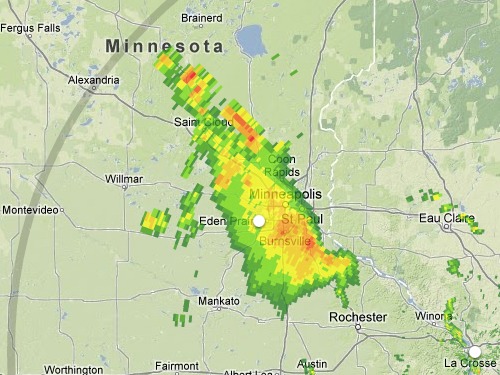
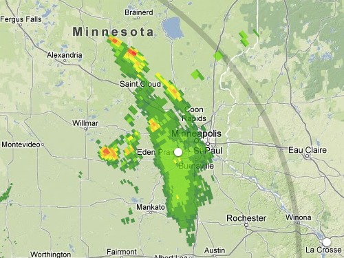
I opened Radarmatic and saw no activity in my area,
but over in Minnesota there was an excellent candidate —
a bright line of storms that Radarmatic painted
as west of Saint Cloud when viewed from the Sioux Falls radar,
but as east of the exact same location when viewed from La Crosse.
You can find Saint Cloud near the storm's northern tip in these images:
Through reading Radarmatic's Google-Maps-powered code —
its JavaScript is delivered to the browser as friendly source code
instead of being minified,
which is very helpful since it is not under an open license
nor published as a public repository —
the problem became clear.
Eric was right!
There was an oversimplification in Radarmatic's sweepArc() function
when it computes where to start drawing each radar sample:
var start_x = radius * Math.cos(start_angle) + center_x;
var start_y = radius * Math.sin(start_angle) + center_y;
The idea behind this code can be expressed this way:
“I want to draw the precipitation
that is at a distance of radius from the Doppler radar,
so how about I just head in that direction across the screen
by moving a corresponding number of pixels?”
Which would be absolutely perfect — if only the world were flat.
The Curse of Mercator
The famous
Mercator projection
used by Google Maps
presents the Earth's lines of longitude
as vertical parallels that run straight up and down the page —
despite that fact that, on the real earth,
the lines of longitude will bulge farthest apart at the equator
and then gradually narrow together as they approach the poles.
This has several consequences.
- The distance between two particular lines of longitude
will look constant all up and down the map —
they are, after all, drawn parallel —
but in fact there is less and less real-life distance
between them as your eye is drawn toward the poles.
So the land forms depicted between two lines of longitude
get magnified as you move away from the equator
and closer to the pole.
- The Mercator projection also varies its vertical scale
as you move up the map, to always match it to the horizontal scale.
(Other cylindrical projections make different decisions
about what to do with their vertical scale, such as the famous
plate carrée
projection.)
So both the x- and y-dimensions start changing scale
as soon as you move north or south.
- Heading off at an angle across the Earth's surface,
even though you travel in a straight line,
will produce a curve on the Mercator map instead.
All of which means that a Doppler radar beam pointing exactly northeast
from Sioux Falls, for example,
across the pixels of a pretty Google Map,
will not actually march diagonally.
It will start its journey by making an exact diagonal,
but it will soon start swinging south as its path —
arcing straight along the curved globe —
warps as it is mapped to the distortion of Mercator's grid.
And, even more importantly at the scales we are concerned with,
the beam will appear to speed up as it heads north,
since distances high on a Mercator map are so much smaller.
A kilometer-long severe storm far north of Sioux Falls
should look larger than one caught at the south end of its beam.
How Radarmatic Could Be Adjusted
Spherical geometry
is the branch of mathematics that deals with these relationships,
and, quite happily, I discovered that I did not need it at all —
because Google Maps already implements the essential formulae in its
spherical
namespace!
This meant that I could close a half-dozen browser tabs
full of mathematics that I had just opened,
and instead just use what Google Maps provided.
The necessary Google Maps functions
are not available to the stock Radarmatic service,
incidentally, because of the URL that it uses to fetch the Maps API.
Instead, a site has to declare this at the top:
<script type="text/javascript"
 src="http://maps.google.com/maps/api/js?libraries=geometry&sensor=false"
 ></script>
With the library in place,
all that is required is discipline:
whenever you want to draw a point on the map,
you must figure out the real latitude and longitude
that you are targeting,
and then submit those values to the API
to learn their true x- and y-coordinates.
If you wanted Radarmatic to render accurate radar maps,
you could simply drop into place
a new version of its sweepArc() function like
the one that I provide in this Gist.
I provide this code as a kind of example tutorial
for anyone trying to work with distance-and-direction data
across the flat surface of Google Maps.
As you will see if you read the code,
there are three crucial steps:
- Find the real latitude-longitude point that you want to plot.
- Use the spherical formulae to turn
that latitude and longitude into an (x, y) for the screen.
- Make sure that you draw that coordinate in the right place on your canvas.
The two really crucial functions to use in this case are:
- spherical.computeOffset(latLng, distance, heading)
- Google has saved us lots of trigonometry with this one.
It speaks only the language of latitude and longitude;
it is a purely real-world function
that has nothing to do with how your Google Map is instantiated
or configured, or even whether you have a map on your page at all!
Given a starting location together with a distance that you plan
to travel along the given heading,
it will figure out where you will wind up —
taking into account all of the complexities of motion
across an oblate spheroid like the Earth.
- projection.fromLatLngToDivPixel(latLng)
- Once you know the real global location
of a point that you want to use in rendering,
this is the function that lets you avoid guessing
about that point's location on the surface of your Google Map.
Real-world latitude and longitude go in, an x and y come out.
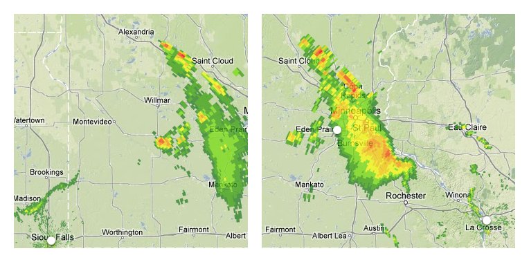
The result is quite gratifying,
as you can see by mousing over this map
to compare the two versions of the image:
Mouse over this image
to compare the corrected Sioux Falls and La Crosse radar scans;
note that the radars now agree about the line of storms
north and east of Saint Cloud!
Of course, there remain many numerous, legitimate,
and interesting differences here about what the two radars see.
Sioux Falls, for example, seems to only see the closest edge
of the severe weather stretching south of St. Paul,
with the rest remaining hidden.
But the radars now agree quite closely
about the overall outline of the storm system they are tracking,
and, most crucially, you can see that
the bright line of storms near Saint Cloud
now has exactly the same position in both images —
just barely northeast of the city, as it happens,
and not far off in the distance as originally mapped!
Radarmatic
does not seem to advertise a bug tracker,
but it does provide author contact information,
so I will send him a link to this article in case he is interested
in tweaking his wonderful service.
Of course, for people located in major metropolitan areas,
the site works just fine —
if you live close to one of the Doppler radars,
then the error will not even be noticeable.
But those of us who are living far from Doppler radars,
who always have to stare at the very edges of a radar plot
to determine whether a storm is coming,
will be quite happy if the site
some day rolled out this improvement.
And, yes, I am, in fact,
the guy who mapped Middle Earth on to Google Earth.
I know.
Small world.